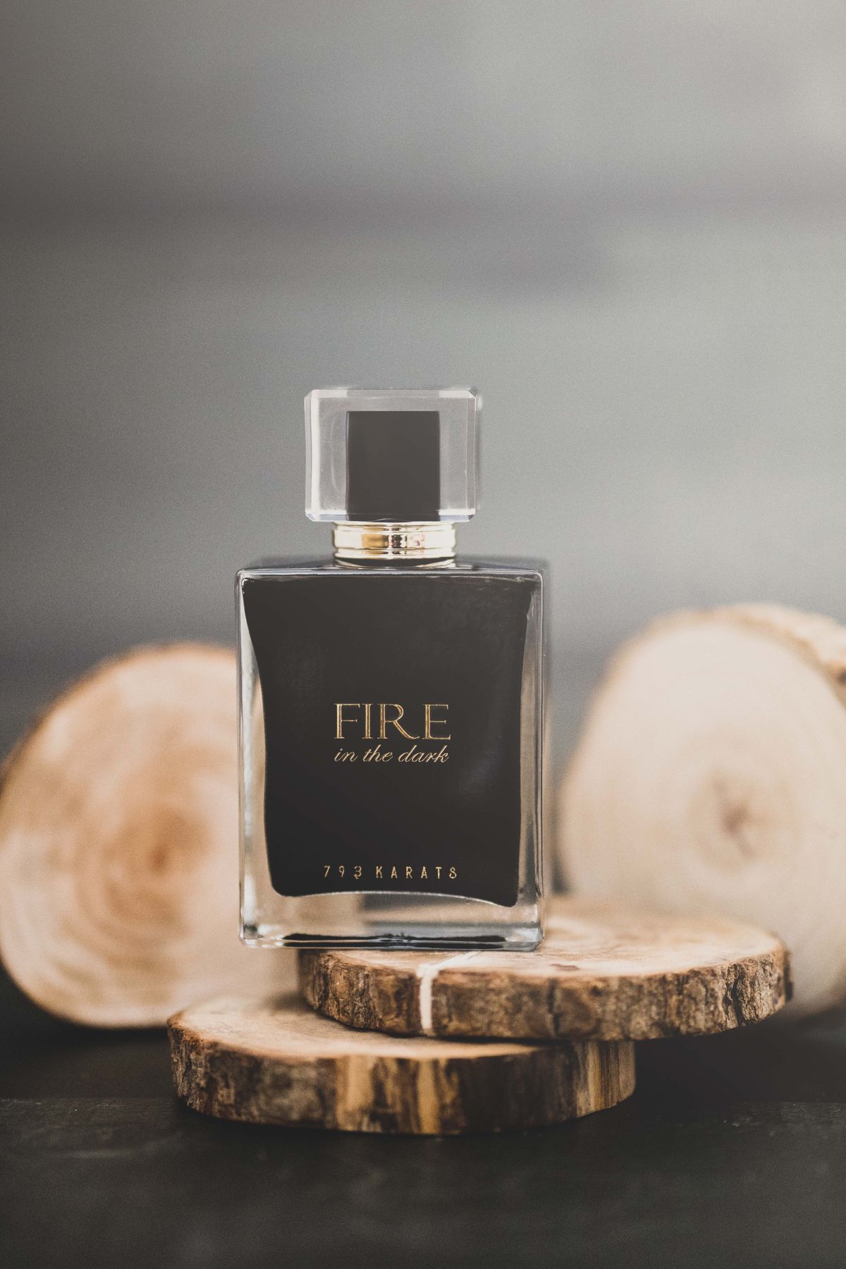
Colour is the fastest way a brand communicates personality. People form impressions within moments, largely driven by colour and shape.
Warm tones like orange and red feel energetic and confident; blues feel trustworthy and calm; greens suggest nature and wellbeing; black and deep navy read as premium and sophisticated. Context and culture matter, so there are no absolute rules.
The strongest palettes are disciplined: one dominant colour, a confident accent and a couple of neutrals. Too many colours dilute recognition and make consistency harder.
We help you choose a palette that reflects your positioning and works reliably across both screen and print — because a colour that looks great online must also print beautifully.
Speak to our team