Food & Hospitality · Branding
Hearty Slice Pizza
A complete brand identity and print system for an independent pizzeria — designed to feel warm, honest and unmistakably local while standing shoulder-to-shoulder with national chains.
Concept ProjectFood & Hospitality
Client
An independent, neighbourhood pizza restaurant (concept project — not a real client)
The Challenge
Independent pizza restaurants often look improvised — inconsistent menus, generic boxes and a shopfront that blends in. The concept needed a memorable identity that felt hand-crafted yet professional, and that could be produced affordably at small volumes.
Goals & Objectives
- Create a distinctive, appetite-driven identity
- Unify menu, packaging and signage
- Keep production affordable for a small independent
Research
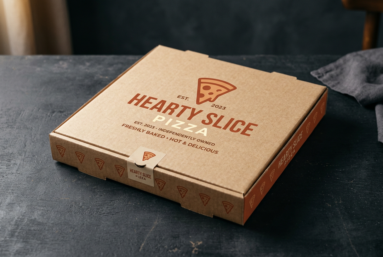
We explored the neighbourhood-pizzeria category, warm hospitality cues and the tactile language of kraft, terracotta and hand-set type.
Strategy
Position Hearty Slice as the friendly local that takes its craft seriously — 'proper pizza, made with heart' — expressed through a warm palette and generous, confident typography.
Creative Direction
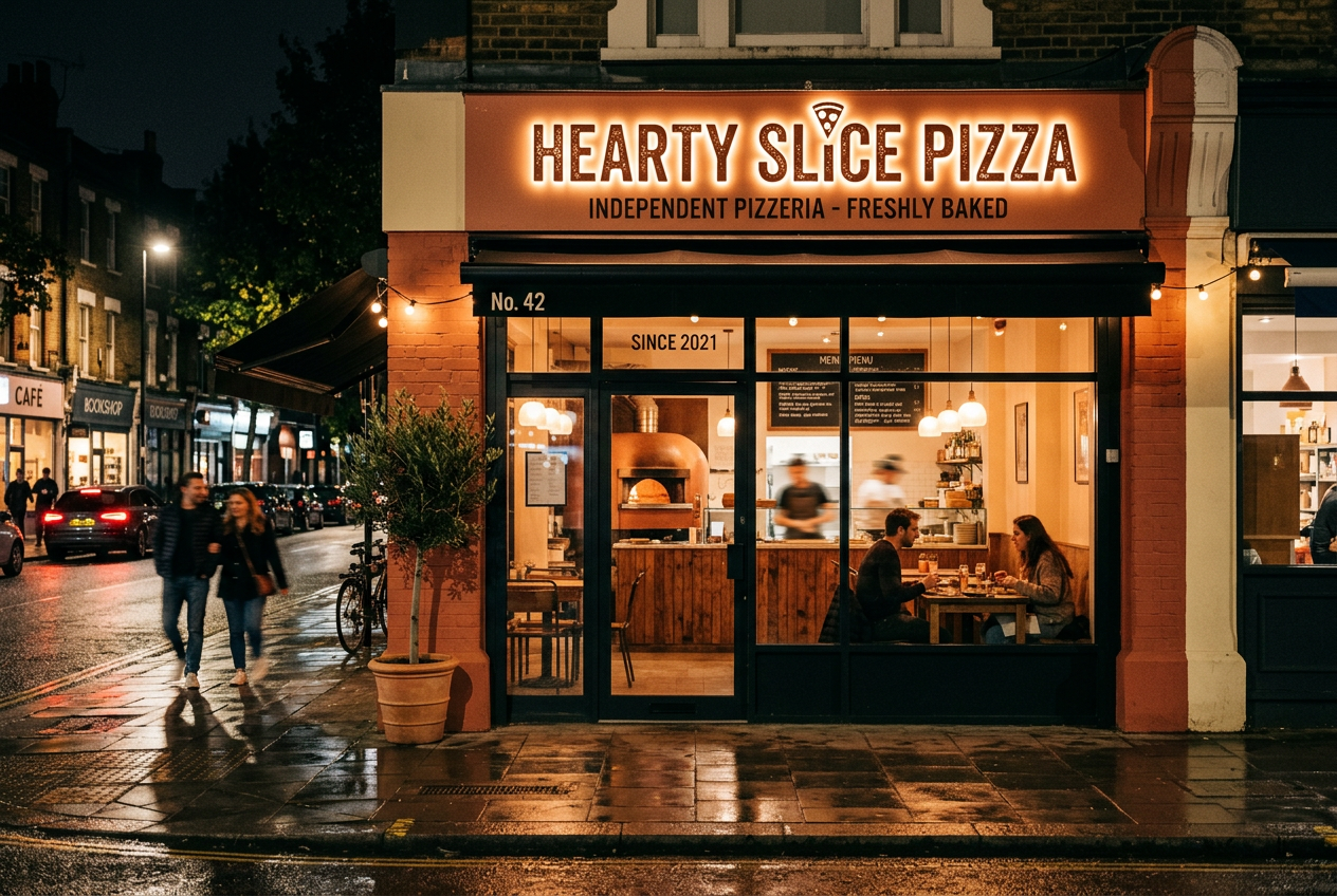
Warm, rustic-modern. A friendly slice mark, honest materials and glowing signage that feels inviting after dark.
Typography
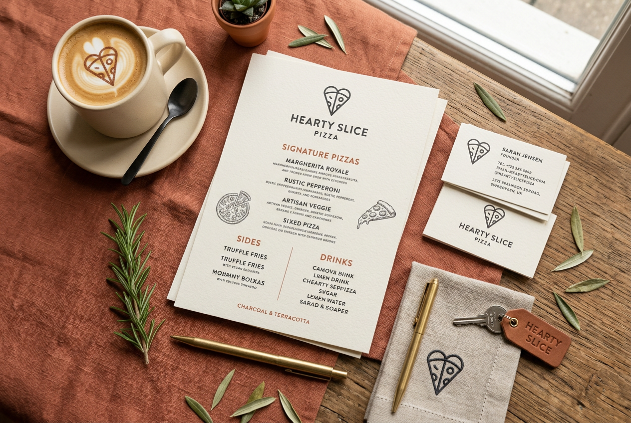
A geometric display face for the wordmark paired with a humanist sans for menus and body — legible, warm and modern.
Colour Palette
TerracottaWarm CreamCharcoalEmber Orange
Deliverables
Logo & brand markMenu design & printPizza box packagingShopfront signageBusiness cards & stationery
Print Applications
Takeaway boxesDine-in menusIlluminated fascia signLoyalty cards
Supporting Visuals
Intended Impact
A cohesive, ownable brand system ready to roll out across the restaurant — designed and printed under one roof for complete consistency.
Lessons Learned
A tight, tactile palette and one strong mark carry a small hospitality brand further than a large, complex system.